The first breakout session I attended was the most interesting. It was titled “iPhone User Interface Design.”
The first point the presenter made was that the percentage of time that you spend on portions of the development cycle is quite a bit different for a successful iPhone app than most software applications. He showed a diagram that looked way cooler than this:
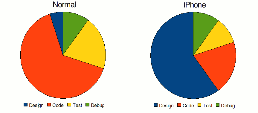
What this means is that you need to spend a lot more time in the design aspects of your app throughout the life cycle than you normally would. This set the tone for the rest of the presentation.
He defined “design” as mapping out requirements, doing the art and layout, and figuring out how core features and navigation are going to work. The cycle for developing a new product should typically go: familiarize, conceptualize, realize, finalize. Executing these well will take your application from average to excellent.
Familiarize
One solid suggestion was to read through Apple’s Human Interface Guide. Apple has spent a lot of time thinking about how people will interact with the iPhone and iPod Touch, so you don’t need to duplicate their work. What’s more, there are many conventions that you will be unaware of and unwittingly break. For example, Apple intends all buttons to have rounded corners, so if you have something that’s not a button, don’t make it rounded. Likewise, buttons should look like buttons because users have a model of what a button looks like and what it does.
The presenter reiterated considerations voiced in the general session, such as thinking about where the user will use the application and considering general properties of the iPhone and how it differs from the web and from a desktop computer.
One significant suggestion was to design for the thirty-second use case. You need to consider that the user wants to open your app and get what they need within thirty seconds. If your app has a bunch of meaningless screens or has poor performance, it will significantly hinder your ability to help them. If it takes twenty seconds to navigate where they need to go, you only have ten seconds to please them. If you can save any time by remembering or determining data (zip code for searching for restaurants, for instance), you should do that. It takes a lot of time and mental effort to type things in on the iPhone, and it would be very annoying if the user has to type something in multiple times.
The Pareto Principle must be invoked at least once per usability discussion, so here goes. You should design for the 80% use case. Make the most common functions be dead simple. With the limited screen space that you have, consider eliminating ancillary functionality. Make your apps hyper-specialized and super-focused. Apps that do everything do nothing. I liked this approach because it reminded me of something that the folks at 37signals would say (review forthcoming.)
Conceptualize
The key to conceptual design is to define a solution not a collection of features.
Consider the example the speaker presented: you are an interior decorator and you learn about the iPhone. You see something that makes you think of creating an interior decorating app. Your mind whirls at how this will make your life so much better. You grab a piece of paper and a pen, and scribble as fast as you can. “Wow, I can take pictures and store them in an album, and then upload it to my Mac. I can generate textures and hold them up to the wall. I can use the iPhone as a level to make sure that my wall hangings are straight. I can use this same app to make estimates of how much a room will take to redo.” The list grows to a page, then two pages.
This is exactly the wrong way to do an iPhone app.
You need to have a very lean feature set. If you start with an idea and brainstorming, or if you are modeling your app off of an existing app, you already have too many features. You need to prune.
A great way to prevent featuritis is to create an app definition statement. This statement summarizes the purpose of your app, and every key design decision that you make should be based off of it. With this much importance, it’s critical that all of the stakeholders buy into it. An example of an app definition statement is “Easy to use digital photo sharing for iPhone users.” Note that this definition statement clearly identifies who will be using the app and what they will be doing with it. Less is more with respect to features. Condensing your app is helpful for team morale and cohesiveness.
Realize
It’s important to understand your application type to make the correct design decisions. Apps live on a continuum of [serious..fun] and [entertainment..tool]. If you have a serious tool, you need the UI to be out of the way as much as possible. The user is just trying to get something done quickly, so there should be few frills. If you have a fun tool, you can get away with more graphics, but not at the expense of functionality. In other words, users will tolerate some distractions. If you have a fun entertainment app, it should be interaction driven and intensely graphical. This would mostly correspond to games. There also exists serious entertainment. This concept might seem silly at first, but could be something like a movie player. In this case, you would want the app to be more data-driven, and have a minimal UI.
These are the extremes, so you should consider to what degree your app is serious or fun and made for entertainment or utility. In conjunction with the app definition statement, this will help you decide what design elements should be used for your application.
As far as aesthetics go, you should remember to avoid having too much stuff on the screen at one time. Ask yourself: does this really need to be on the screen? Could it be hidden instead? Also: what’s important right now? Could this be shown later or on a different screen? Avoid layout cramming and make sure that your padding is consistent throughout the app. This is a professional touch that will separate you from the crowd. You should use built-in controls where appropriate because users are familiar and they are well tested, which saves you a lot of time. If you have options that aren’t commonly changed, put them in the global options file so you don’t have to keep showing them.
The biggest message to me of this section was to do paper prototyping or “iterate with paper.” Many fewer resources need to be expended to create a paper mock-up of the screens you are going to have, and getting the flow down is critical to the end user experience. You need to solve for all of the edge cases up front and see where your metaphors break down. Doing this on paper lets you experiment with several ideas and see which one fits your target user the best. One recommendation that made a lot of sense was to actually Xerox your iPhone or create a stencil to create a template that has exactly the right dimensions.
The presenter demonstrated how several apps evolved through time and it was clear that spending time with design was crucial to get their apps working optimally.
iPhone specific
This section is pretty specific, you can skip it if you aren’t interested in some nitty-gritty details. However, there’s one more section after this one.
For navigation, the standard is to move from left to right as you progress through the app. You should have a navigation bar with a title to give users an idea of what they are looking at. There should also be a back button. You should provide controls to filter data down.
A de facto standard is to have any kind of element addition be in the top right-hand corner of the screen. The same is true of edit controls.
Although you should have a title for context, you should avoid breadcrumbs and home buttons. Breadcrumbs are not scalable due to screen real estate, and both breadcrumbs and home buttons provide the possibility for a state change that is dangerous to the user’s mental model. If they accidentally tap one of the links in the breadcrumbs or hit the home button, they will become very confused and frustrated. This works for the web, but not on the iPhone, based on what Apple has seen in apps.
When you use lists and pickers, try to group similar items if possible. Associate an icon, as the eye typically sees icons first, then words. If you do have icons, try to make them minimalistic. If you have multiple screens with tables, try to switch the formatting up a bit to let the user feel like they are making progress. One more note on pickers: they are optimized for 12 items, which happens to be three swipes of a finger. :)
Finalize
You can (and should) enhance your application with photos and imagery. This aids in quick recognition of your app. Your icon is really key, as it is the first thing people will look at when they are evaluating whether your app is worthy or not. One thing that I probably never would have thought of is that users actually appreciate expensive-looking textures. If you can get some mahogany or marble or polished chrome textures, these will make your app look more valuable than other apps with standard backgrounds or textures. Don’t go all out and then skimp in the finalizing section. While your app will have great value, people often judge the book by its cover.
You can add excitement with animations, but be sure not to go overboard. You want them to give feedback so they are functional. A great example is how the iPhone home icons jitter when you are trying to move an application around. Functionally, this shows the user that they have entered a different mode than the standard mode. Emotionally, they see that some of the icons are excited because they might get to move to the front page, and some icons might be shaking because they are worried that the might get deleted! :) So it is fun and entertaining and also gives insight into the current state of the system.
I think that communicating application modes is a very important topic. My own example is when you start typing something in Microsoft Word but you keep overwriting characters that they have already typed. Because the ‘insert’ mode is not shown well, you might have no idea what the heck is going on, and can be extremely frustrated or even lose data.
Once you release, you can’t rest on your laurels. You should keep iterating and use customer feedback if you can get some. Better yet, if you can somehow track which features users use and how they use them, you can use this data to improve it empirically. That’s something I just thought of. But overall, you need to make sure that every release you have is high quality. Users don’t have patience with this kind of stuff. They will just uninstall your app without waiting for updates.
Let’s summarize: familiarize, conceptualize, realize, finalize. One more post to go-and that’s a lot of -izes!